Planaday: User Experience Design

This fourth-semester project was my first deep dive into UX/UI design. Tasked with creating a Figma app simultation addressing a real-world problem, we applied the design process—from research and ideation to wireframing and prototyping—developing a user-centered concept presented through a promotional video.

Planaday was born from the common frustration of organizing day trips. People often find the process overwhelming due to a lack of experience, past negative experiences, or the sheer stress of planning. The goal was to provide a supportive digital tool that makes planning simple, engaging, and stress-free.

Our solution was to combine a user-centered approach with an intuitive and dynamic interface. The app transforms trip planning into an enjoyable and accessible experience, helping users create their perfect day with confidence.
Description of image
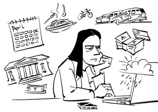
Meet Paula, our first user persona. She's currently experiencing the troubles Planaday is designed to combat.

The application incorporates smart scheduling algorithms that help users allocate realistic time for tasks based on historical data and task complexity. Priority-based organization ensures important tasks receive appropriate attention while maintaining flexibility for unexpected changes.

Visual design elements use color psychology and typography hierarchy to create an interface that feels both professional and approachable. The user experience prioritizes quick task entry and modification while providing comprehensive planning capabilities for users who need more detailed organization.

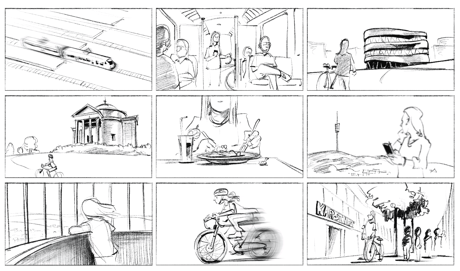
With the theoretical framework established, we translated our ideas into wireframes and storyboards. This process helped map out a clear user journey of one of the personas, guiding the screen design and revealing how the app could be used in real-world scenarios. Multiple rounds of sketching ensured that no key elements were overlooked.

Key Features Illustration
A Storyboard depicting our user journey, which we later used for the movie

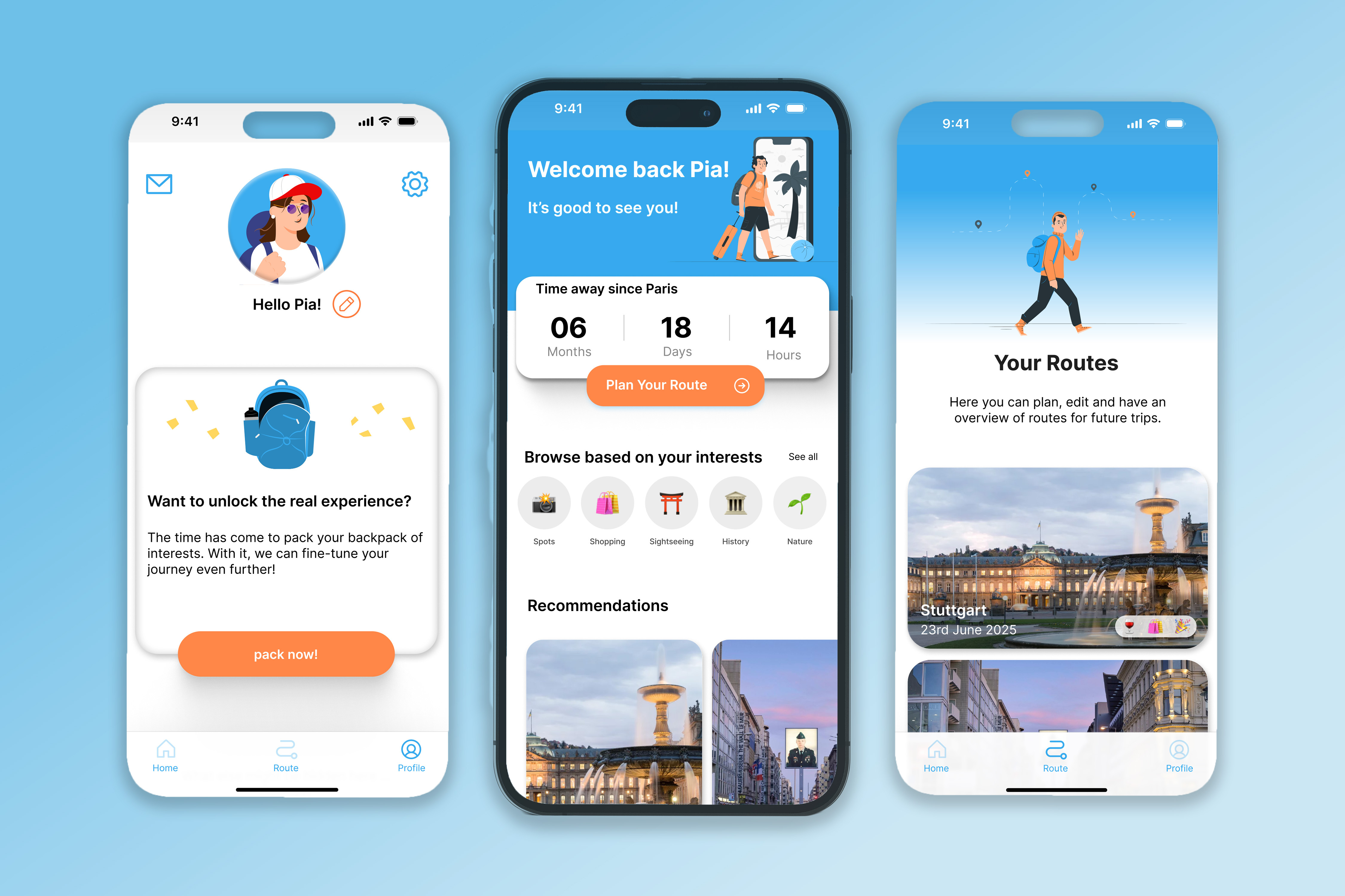
The final interface went through several iterations, with each stage incorporating user feedback. We chose a light blue and orange color palette paired with illustrations to give the app a fun, approachable, and lightweight feel. Key features included a smart scheduling algorithm for realistic plans, a priority-based system to balance flexibility and focus, and visual design choices that emphasized clarity and efficiency.

Design Process Bottom 1
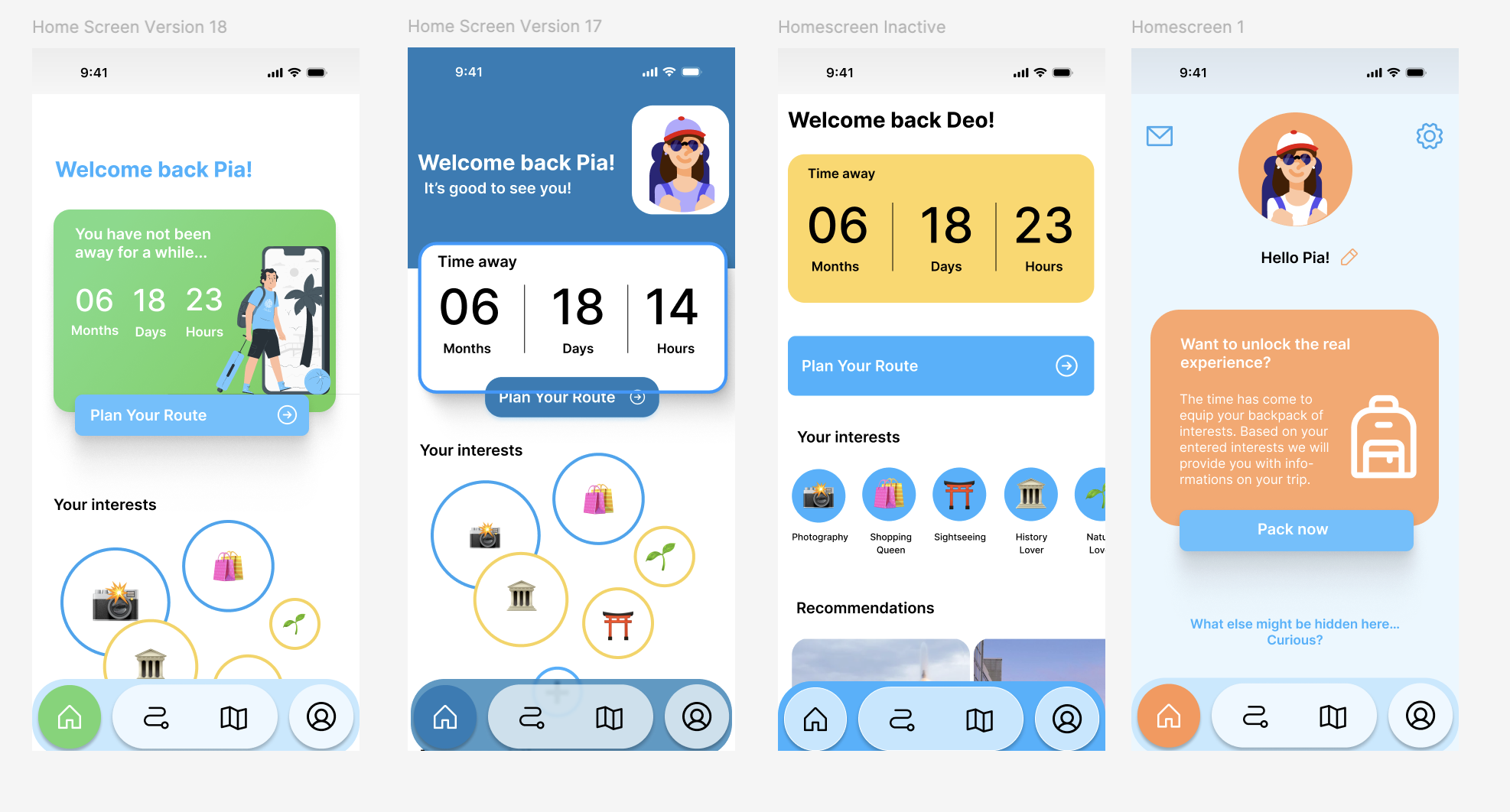
A Snapshot of the Different Styles and Visuals used during Planaday's design process.

The application incorporates smart scheduling algorithms that help users allocate realistic time for tasks based on historical data and task complexity. Priority-based organization ensures important tasks receive appropriate attention while maintaining flexibility for unexpected changes.

Visual design elements use color psychology and typography hierarchy to create an interface that feels both professional and approachable. The user experience prioritizes quick task entry and modification while providing comprehensive planning capabilities for users who need more detailed organization.

Key Features Illustration
A sneak peek into Planaday's final interface design. To see more, follow this Figma prototype .

To communicate the concept, we produced a three-minute promotional video, filmed on location in Stuttgart. The video was showcased at the semester exhibition, where the app received positive feedback and was awarded a Go-HfG Card, highlighting its potential for future development.

Overall, the Planaday project was a valuable experience that deepened my understanding of user experience and interface design. It demonstrated the importance of thorough research and an iterative process in creating a meaningful digital solution.